Understanding Histograms
"Perfect Exposure and Colour Balance"Original Article by Helen Harris
"Article first featured in Olympus User Magazine"
DIGITAL CAMERAS ARE clever things, and one of their cleverest tricks is their use of histograms. These have the ability to show you a real time ‘tone map’ of the photo you have just taken.
Depending on your camera, you open the histogram on the LCD screen at the back and it gives a visual representation of the tonal range of the shot, with deep shadows on the left, midtones in the middle (e.g. greys and greens) and highlights on the right. As such, it’s both a handy visual guide and a diagnostic tool, showing you areas of the shots that are under or over exposed. You can then make the necessary adjustments to compensate for this.
The histogram can be turned on and off in an instant, giving you an illustration of how 256 levels of brightness are distributed in a photo. The darkest shadows are 0, the highlights are 255, and the line running from left to right shows the increasing brightness in your image. Meanwhile, the peaks in the histogram relate to the amount of colour information.
Using the Histogram
Histograms can be used to check the exposure of a shot when out taking photos or when editing your shots in Olympus Master or other software.
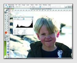
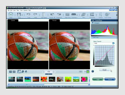
1Overexposure

On this image we can see how the graph in the histogram (shown for convenience in Photoshop, but it will be similar on your camera
display) is gathered at the right, suggesting we have overexposed and blown out the highlights. You can then rectify this for the next shot by using a faster shutter speed or smaller aperture, for instance.
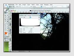
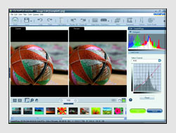
2Underexposure

Here we have the opposite problem. The graph is gathered to the left, suggesting there is too much shadow – so you’ll have to take the necessary steps to rectify this. A histogram reading will always be more accurate than relying on how a photo looks to your naked eye, so learn how to use it and it won’t let you down.
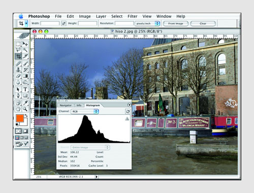
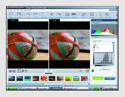
3Better balance
For better all-round exposure, the curves and peaks of the histogram will be more consistent and well-distributed, without excessive ‘clipping’ at either the shadow or highlight end. Don’t get obsessed with replicating the same graph every time – each photo is different, and different colours will create their own peaks.

Note also that because of the way our eye interprets photos, clipping at the left (shadow end) will be less problematic than clipping at the right, which can result in details being ‘blown out’. Take some of your favourite photos and see what the histogram reveals.
Histograms and Software
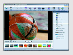
OK, so we’ve established how useful the histogram can be as a tonal chart. However, squinting at a small graph on your camera’s LCD is not ideal, which is why histograms are also built into photo-editing software. In this example, we’re looking at working with the histogram in Olympus Master 2, which is currently included with Olympus cameras. If your camera was supplied with the original version of Olympus Master, first open an image, then select Edit from the top of the screen. You will then be able to select Tone Curve from the Filter drop down menu.

Step 1: Open the image you want to work on in Olympus Master 2 and select ‘Tone Curve’ from the list on the right. You can also choose ‘Auto Tone’ if you want the software to make all the decisions for you.

Step 2: You will now see this screen, with two window panes. The preview one to the right shows the implications of making adjustments to the photo. You make tonal adjustments by moving the red diagonal line on the tone curve chart.

Step 3: This image is actually pretty well-exposed – the peak is reasonably smooth and well-defined, without excessive clipping at either end, but it’s easy enough to adjust the tonal range by moving the curve. The histogram changes before your eyes, and if you mess things up, simply click ‘reset’.

Step 4: Note that you can also adjust red, green and blue colour channels individually. Again, just drop the tone curve to adjust the colour tone in increments. You can add up to 14 control points in the curve and lock their values. To delete a control point, just select it and hit ‘delete’ on your keyboard.
toptips
1
You’ll really benefit from understanding histograms. However, remember that they are only a visual guide – don’t miss a shot because you are obsessing with the graph.
2
With high-key shots, most of the tonal range is concentrated on the highlights; with low-key shots it’s concentrated in the shadows. Think before you shoot – do you want your subject to be high-key or low-key?
3
If your camera supports this, get it to show the separate colour channels in the histogram for a more accurate tonal reading. On newer E-System cameras this is done by successively pressing the INFO button to display first the four colour histograms then a larger version of the standard histogram.

4
You can get wild effects by experimenting with histograms. Try selecting an old photo and then drastically altering the histogram to transform it into a psychedelic work of art. Don’t forget to save the new ‘pop art’ photo as a different file though!

© Olympus UK
Click here for more Tutorial Articles by OM Systems
(formerly Olympus Cameras).
Return from Understanding Histograms to the Photography Tutor page.


