

Colour Calibration
|
... or red RED, or any colour "correct" for that matter?There has
been much discussion recently about colour calibration and how to "get
it right" in one of the photographic forums.
In a perfect world, any printed photos we produce from our printer (or have produced by a printing company) would look the same as the photos do on our computer monitor. In turn, they would look the same as the original subject that we photographed (or scanned). Not only would the colours all match, but so would luminosity (taken to mean brightness in photography). |
 |
If you are in this
"perfect world" already then you are very fortunate.
For many of us, who have wasted much paper and ink, and have possibly
spent more than we planned on equipment by having to purchase
additional colour calibration hardware and software, not everything in
the
garden is so rosy, or is it crimson?!?
So, how do we
achieve this perfect world? First and foremost, accept
that it is very rarely attainable.
There are a number
of reasons for
this, one of which is that colours appear to change under different
lighting conditions. Do you have orange street lighting in your area?
Take a sheet of white paper outside in the middle of the day and it
looks white, yes? When night falls and the street lights come on, take
that same sheet of white paper outside. What colour does it appear to
be ???
If there is
to be any
chance of getting colours and luminosity consistent then the
image MUST be viewed under the same lighting conditions throughout.
Although, in theory, this could be done with any type of light source -
from candlelight to bright sunlight - for practical purposes it is best
to use daylight, a light source of colour temperature around 5500K.
There's more about this at -
The
majority of my photography is artistic in that I seek a result which
pleases me and those who view my work. I rarely undertake documentary
work which requires complete accuracy to the extent that the print must
match the subject in all respects.
I am fortunate in that my world of colour calibration is as perfect as I want it to be. Generally speaking, the prints from my R1800 and from the three printing companies I use match my screens which match the original subject photographed when all viewed in the same lighting conditions. That's good enough for me. It's not completely perfect because I use a PC and an iMac - the characteristics of their screens means that they display images slightly differently. As far as I know, they will never appear identical. If you know different - please contact me and let me know how. How do I handle
Colour Calibration? Try this -
1 - Take a photo of a test card or a subject with many colours, including red, green, blue, black and white, outside in daylight. 2 - View the photo on the screen once the screen has been warmed up for at least half an hour (curtains drawn, no house lights on unless you have daylight 5500K bulbs). If you are happy that the image on the screen looks the same as the subject itself, LEAVE WELL ALONE - IF IT AIN'T BROKE DON'T MEND IT!. If you are not happy, then at least give any colour calibration software that is already installed on your PC or Mac a chance. With perseverance, you might be fortunate and be able to adjust things and improve things to a point where you are happy with the results, even if they are not perfect. If you are still not happy then, and I recommend only then, invest in some calibration hardware and software. Please let me know how you get on over at - 3
- If you really want to be particular, consider adjusting your camera's
screen settings so that you can assess your photo more accurately as
soon as you have taken the shot -
4 -
Finally,
make sure you have the correct software driver installed for your
printer. I learned the hard way when I started using a Mac as well as
my trusty PCs last year. More about this at -
When you are sure,
then run the printer's "print or nozzle check"
routine just to make sure there are no blocked nozzles, alignment
issues or other nasties. It's surprising how a printer which has been
idle for a couple of weeks can get "out of shape". As an aside, I
always run off at least one print a week just to keep things running
smoothly.
All ready? Print the photo using the correct ICC profile for the paper being used - e.g. Epson Premium Glossy. If you have followed all of the above then the chances are that the print will look pretty good. If not, then double check that Photoshop, or whatever imaging software you use, is controlling the printing and disable the printer's colour management. 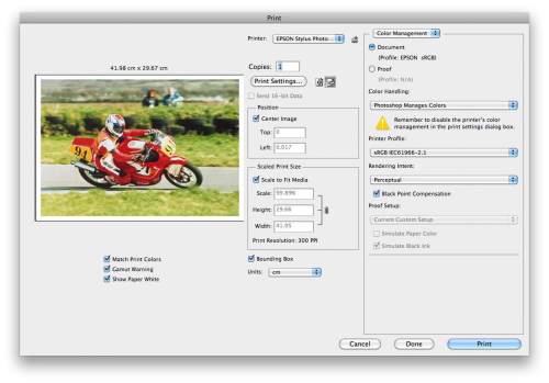 ... if
you can't read the microscopic text, try right clicking on the image
and opening it in a new window.
Still unhappy? Maybe you need to invest in one of the colour calibration products that caters for printers as well but they are not cheap - some costing as much as a new laptop or lens!! However - FINAL THOUGHTS AFTER FIFTY YEARS EXPERIENCE WITH PHOTOGRAPHY FROM PLATE THROUGH ROLL FILM TO DIGITAL. "When
folk view your prints they will have no idea what the original
subject looked like - and you will have most likely forgotten.
Was Constable's Haywain really that colour?" Further reading - www.better-photographs.com/digital-photo-printing.html |
|
|

 |
![]()
| Image of the Month |
 |
| Click here to download it. |
| Find It |

Custom Search
|
| All of the advice, tutorials, masterclasses and ideas on this website are available to you at no charge. Even so, its upkeep does incur costs. |
|
| If you feel that
the site has helped you then any contribution you make, however small,
would go towards its ongoing maintenance and development. Thanks for your help. |
| Book of the Month |
 |
| Click here to read the review. |
|
|